
Content
As an interior design specialist, I understand the importance of color in creating a harmonious and inviting atmosphere in your home.
The right color palette can transform a space, making it feel larger, cozier, or more modern.
However, choosing a coordinated color palette for your home is not always an easy task.
It requires a keen eye for color, an understanding of color theory, and a bit of creativity.
In this article, I will guide you through the process of choosing a coordinated color palette for your home.
Understanding color theory
Before you start picking out paint swatches, it’s important to have a basic understanding of color theory.
This will help you understand how colors interact with each other and how they can influence the mood of a room.
The color wheel
The color wheel is a tool used by designers to understand the relationship between colors.
It consists of primary colors (red, blue, and yellow), secondary colors (green, orange, and purple), and tertiary colors (colors created by mixing primary and secondary colors).
Color schemes
There are several types of color schemes based on the color wheel:
- Monochromatic: this scheme uses different shades and tints of one color.
- Analogous: this scheme uses colors that are next to each other on the color wheel.
- Complementary: this scheme uses colors that are opposite each other on the color wheel.
- Triadic: this scheme uses three colors that are evenly spaced around the color wheel.
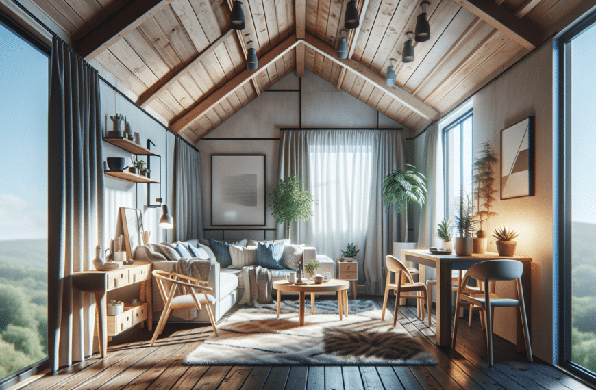
Selecting your base color
The base color is the dominant color in your palette and it sets the tone for the entire room.
When selecting your base color, consider the mood you want to create.
For example, blues and greens are calming colors, making them a good choice for bedrooms or bathrooms.
Reds and yellows are energizing and can be used in living rooms or kitchens.
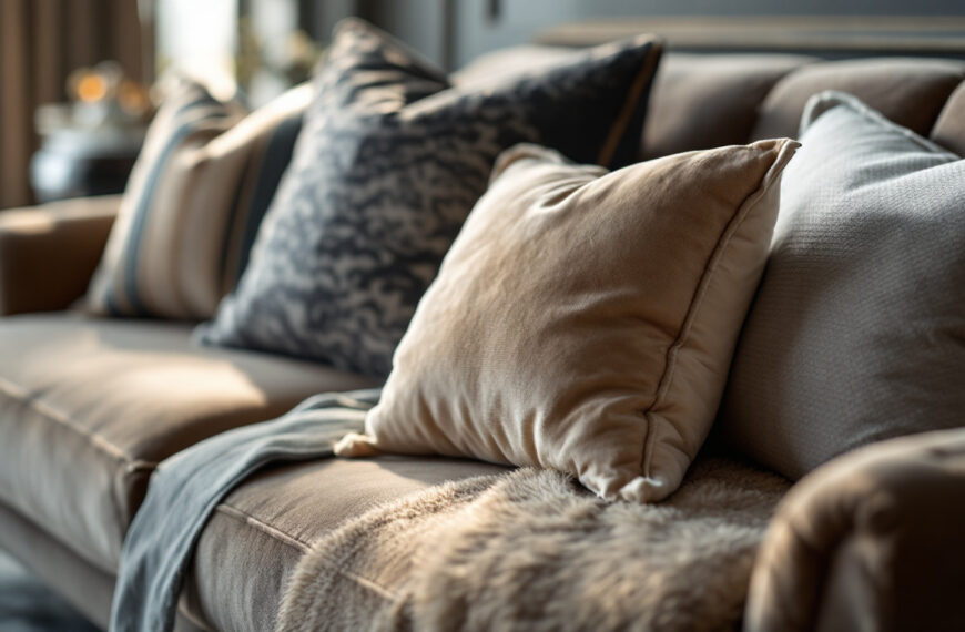
Choosing accent colors
Accent colors are used to add interest and contrast to a room. They should complement your base color, but not overpower it.
A good rule of thumb is to use your accent color in at least three places in the room to create a sense of balance.
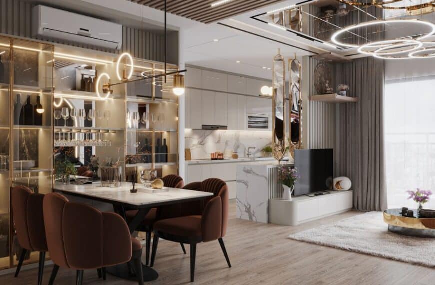
Considering lighting and space
The amount of natural light a room receives can significantly impact how a color looks.
Lighter colors can make a small room feel larger and more open, while darker colors can make a large room feel cozier.
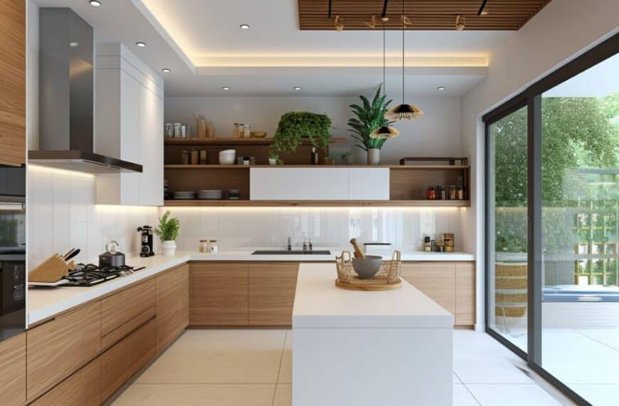
Testing your color choices
Before committing to a color palette, it’s a good idea to test your choices.
Paint swatches on the wall and observe them at different times of the day and under different lighting conditions.
This will give you a better idea of how the colors will look in your space.
Remember, choosing a color palette for your home should be a fun and creative process.
Don’t be afraid to experiment with different colors and schemes until you find one that feels right for you. Happy decorating!